
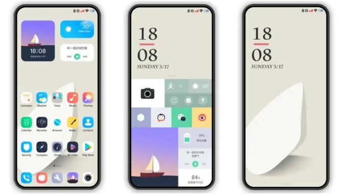
Figuring out how do I organize my phone home screen to be more productive sounds like a small thing, but your home screen is the most-viewed interface in your life. Every time you pick up your phone, it either points you toward what matters or toward a slot machine of distractions. I redesigned mine a year ago following the principles below, and my screen time dropped 25% while the stuff I actually needed got faster to reach.
How Do I Organize My Phone Home Screen to Be More Productive? The Core Principles
- Home screen = tools, not temptations. Your first screen should contain only apps that serve your intentions: calendar, notes, maps, camera, messages from real humans. Social media, games, and news go elsewhere.
- Every app earns its place. If you have not opened it in two weeks, it does not belong on the home screen. Be ruthless.
- Reduce to one or two pages. Endless swiping through pages is where 20-minute “quick checks” go to die. Everything important within one swipe.
- Search beats browsing. On iPhone, swipe down and type; on Android, swipe up for the app drawer search. Organizing for search (knowing app names) is more productive than organizing for visual scanning.
The Recommended Layout (Steal This)
Home screen (page 1): Daily drivers only
- Dock (bottom row): Phone, Messages, Browser, Camera. The four apps you reach for constantly.
- Top area: A calendar widget showing today’s agenda. Seeing your day every time you glance at your phone is quietly transformative.
- Middle: 8-12 essential apps max: email, notes, maps, banking, authenticator, music/podcasts, tasks/to-do, photos.
- One smart widget: Weather, or a notes widget with your current priority list. Widgets put information on screen without opening anything.
Page 2: Useful but not daily
Folders by function: Finance (banking, budgeting, investing), Travel (airlines, hotels, rideshare), Shopping, Health (fitness, medical), Work (Slack, docs, VPN). Folders add just enough friction to prevent mindless opening while keeping things findable.
Social media and time-sinks: Off the home screen entirely
Move Instagram, TikTok, X, Reddit, and games into the App Library (iPhone) or deep in the app drawer (Android), or a folder on the last page. You can still open them intentionally via search, but they stop ambushing you. This one change does more for productivity than any other. I also turn off their badges and banners so they cannot pull me back.
Focus Modes: Automation That Actually Works
- iPhone Focus modes: Set up Work, Personal, and Sleep focuses with different home screens for each. My Work focus shows only work apps and silences everything else; switching contexts becomes a single tap. (Settings > Focus > customize Home Screen pages per focus.)
- Android: Use Focus Mode in Digital Wellbeing to pause distracting apps on schedule, and Bedtime Mode to grayscale the screen at night. Work profiles (Android for Work) separate work apps entirely.
- Notification audit: Go through Settings > Notifications and disable everything that is not from a human or time-critical. Most people’s notification lists are 80% noise. This pairs with home screen organization: fewer badges demanding attention, calmer mind.
Small Tweaks With Big Impact
- Grayscale or dark mode: Colorful icons are designed to attract taps. Grayscale (Accessibility settings) makes the phone dramatically less appealing for idle scrolling.
- Move the browser off page one if aimless browsing is your weakness. Keep it accessible via search, not one tap away.
- Put your to-do list widget front and center. Seeing “3 tasks remaining” with every glance is gentle accountability.
- One wallpaper, calm. Busy wallpapers make icons harder to find and add visual stress. Simple dark or nature wallpapers win.
- Delete, do not just hide. Apps you never use should be deleted (offload on iPhone to keep data). A tidy app library is part of the system.
- Charge outside the bedroom. The most productive home screen organization is a phone that is not next to your pillow.
Maintaining the System
Do a 5-minute monthly audit: delete apps you have not opened, check whether social apps crept back onto page one, and review Screen Time/Digital Wellbeing stats for surprises. Systems decay; maintenance is the price of a calm phone. I do mine on the first Sunday of the month with coffee, and it has stuck for over a year.
The Bottom Line
Organize your phone home screen for productivity by keeping only daily-driver tools on page one (with a calendar widget), grouping the rest into functional folders on page two, banishing social media and games off the home screen entirely, auditing notifications ruthlessly, and using Focus modes to match your screen to your context. Your home screen should serve your intentions, not advertisers’. Set it up once, audit monthly, and watch your screen time drop while your actual output rises.
Frequently Asked Questions
How many apps should be on my home screen?
Aim for 8 to 12 on the first page plus 4 in the dock. This covers genuine daily drivers without visual clutter. Everything else belongs in folders on page two or in the app library/drawer. If you cannot name a specific weekly use for an app on page one, it does not belong there. Ruthlessness here is the entire game.
Should I use folders or keep apps visible?
Use folders for page two and beyond, organized by function (Finance, Travel, Health), not by vague categories. Keep page one folder-free for instant access to daily tools. One exception: a single “Distractions” folder on the last page for social apps you have not deleted, adding just enough friction to break mindless opening habits while keeping them findable via search.
Do widgets drain battery?
Minimally. Well-designed widgets (calendar, weather, notes) sip battery updating a few times hourly. The impact is negligible compared to screen time itself. Avoid dozens of constantly-refreshing widgets (news tickers, stock trackers updating every minute), which do add up. A handful of useful widgets is a fine trade for the glanceable information they provide.
How often should I reorganize my home screen?
A quick monthly audit (5 minutes) plus a deeper seasonal reorganization works well. Apps creep back, new downloads land on page one by default, and your needs change with semesters, projects, and seasons. Tie the audit to something monthly, like the first Sunday, and it becomes a habit rather than a chore. Systems decay; maintenance is the price. Both platforms document these features; see Apple’s Screen Time documentation for iPhone.
Leave a Reply